Green Tree
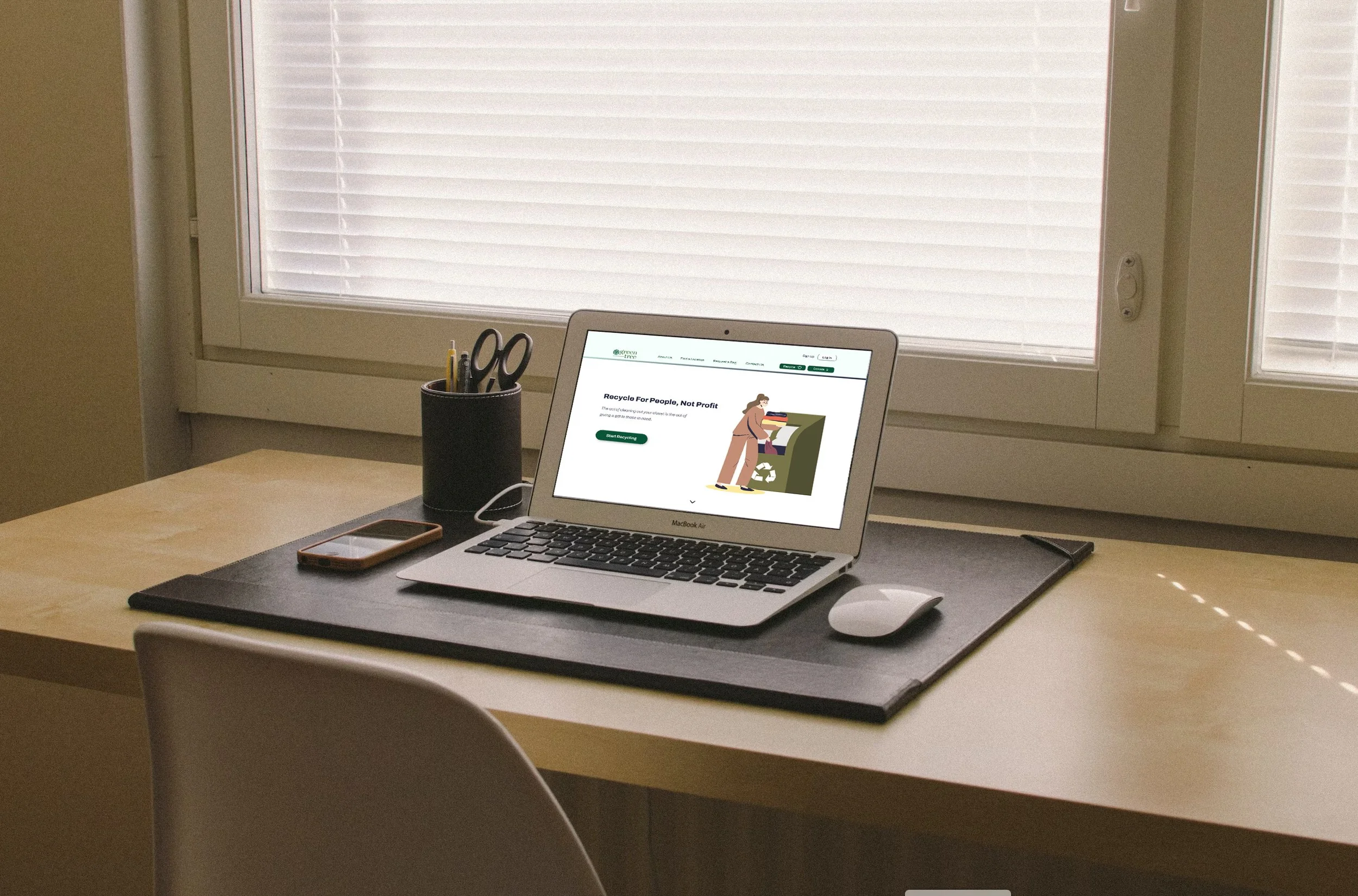
This team project is a responsive website redesign for a local non-profit textile recycling organization named Green Tree
Team: Mercury Huang, Margaret Allotey-Pappoe, Anthony Mero
My Role: Researcher, UX/UI Designer
Duration: 3 Weeks
Timeline: August 31, 2023 - September 20, 2023
Project Scope: 30+ Screens, 20+ Surveys, 5 Interviews, 10+ Testings
Tools: Figma, Adobe Illustrator, Adobe Photoshop, Google Suite
Problem Statement
The Green Tree website’s layout and user interface has an abandoned and outdated feel making users not trust and see it as credible
Proposed Solution
Design a responsive website—giving it a modern, clean and fresh look. Negative space was used to suggest decluttering and enhance contrast and hierarchy on each page
User Research
•
•
•
•
•
Surveys
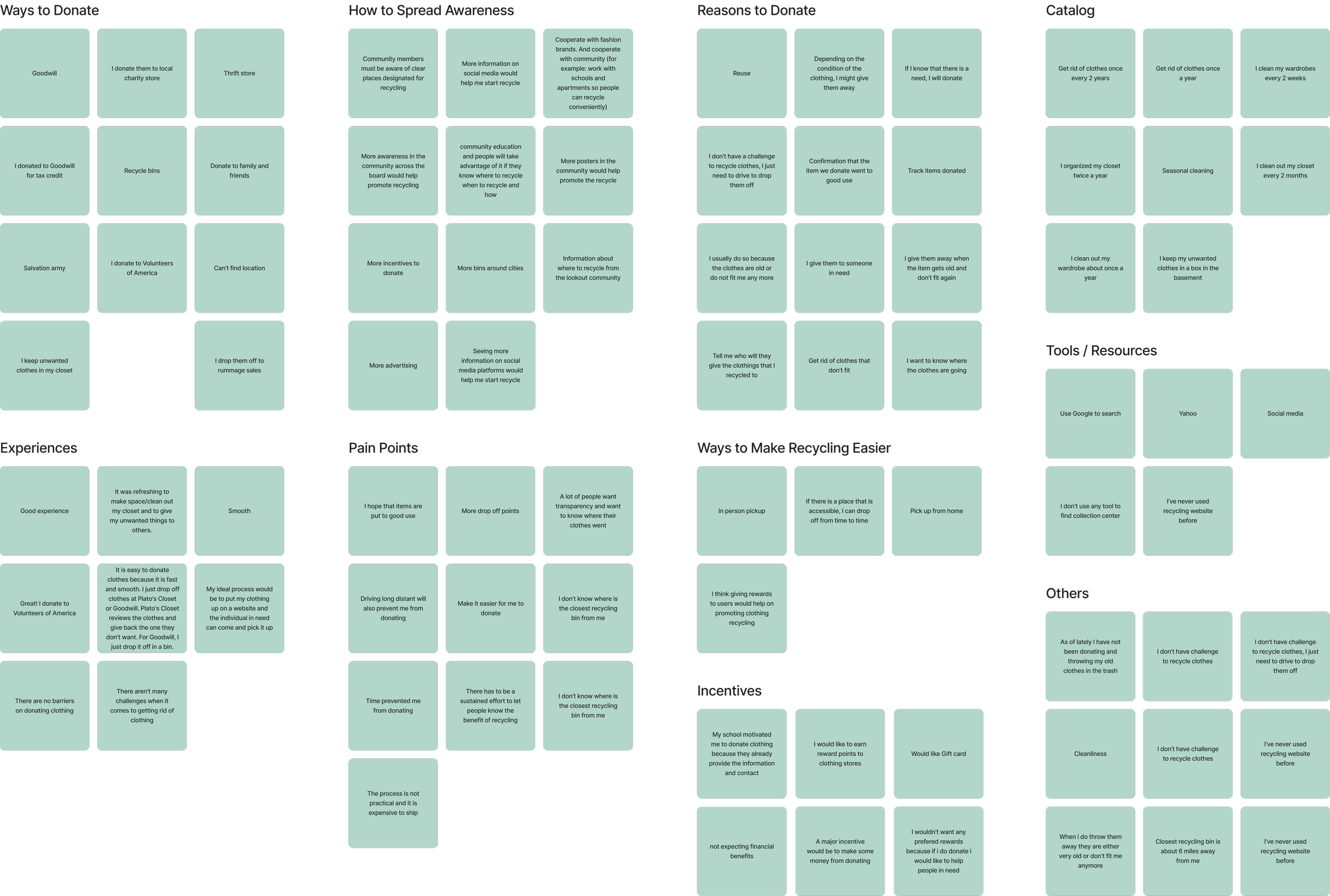
We discovered that 81.8% of people had challenges recycling/donating unwanted items, and most people organize their wardrobes every season and get rid of their unwanted items once a year
We categorized our data using an affinity diagram and discovered a commonality among users: a reluctance to invest excessive time and effort in the donation process. Users expressed a willingness to recycle more if the recycling process were made simpler. Additionally, many suggested to have a pickup option to increase donations
Interviews
User Persona
From user research, we defined our user persona as:
1 - Someone who buys fast-fashion
2 - Who lives in New York and lack storage to put her clothes
3 - A person who likes to be organized which she cleans more often
User Journey
We discussed and came up with our user’s happy journey to locate a Green Tree drop-off box and successfully dropped her items in the closest recycling location
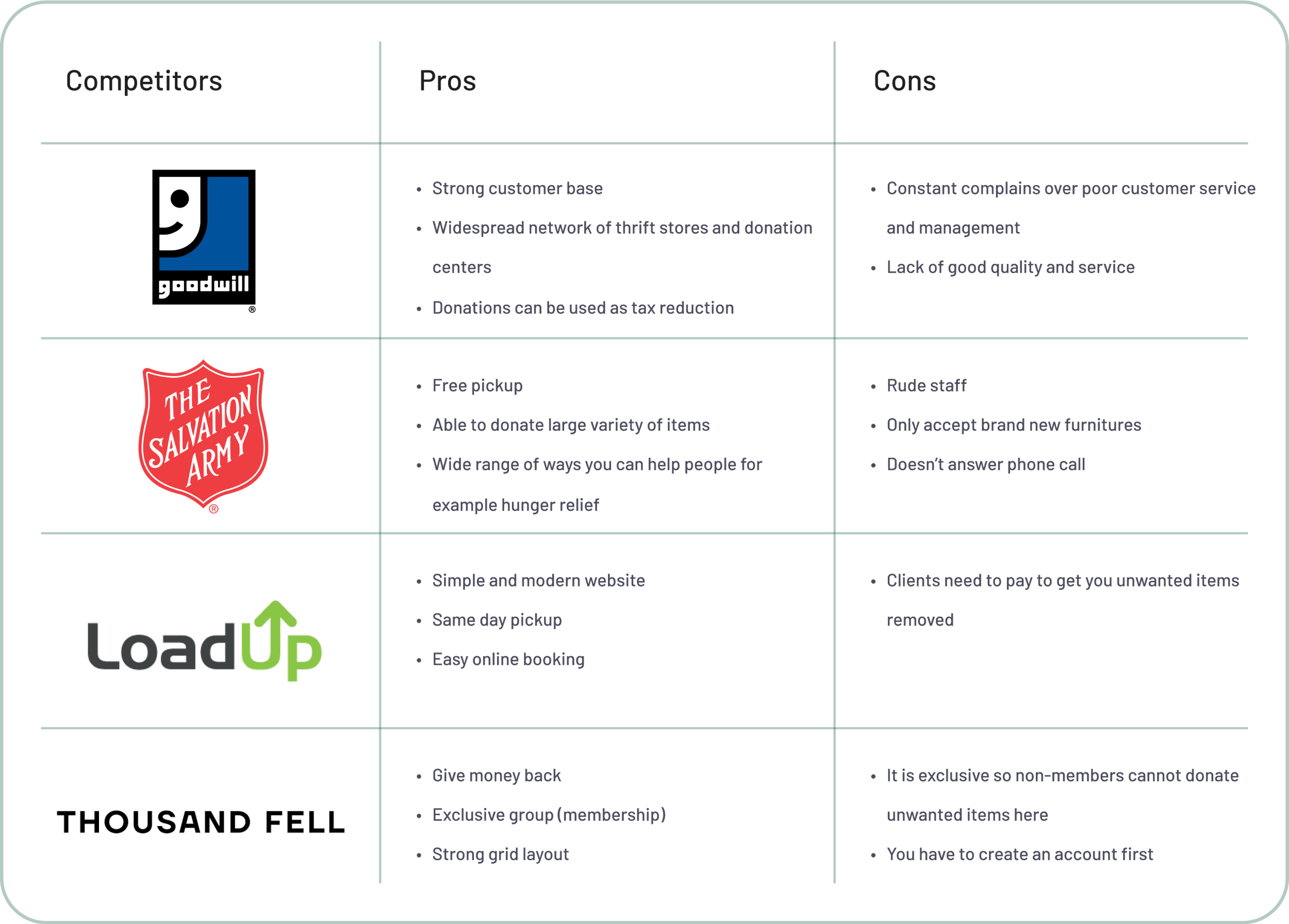
Competitor Analysis
We defined our competitor analysis and found that the clean and modern layout of a recycling website favors the audience
Ideation
Brand Voice Analysis
•
We defined our brand voice as a reliable connector who’s honest and believes in charityd modern layout of a recycling website favors the audience
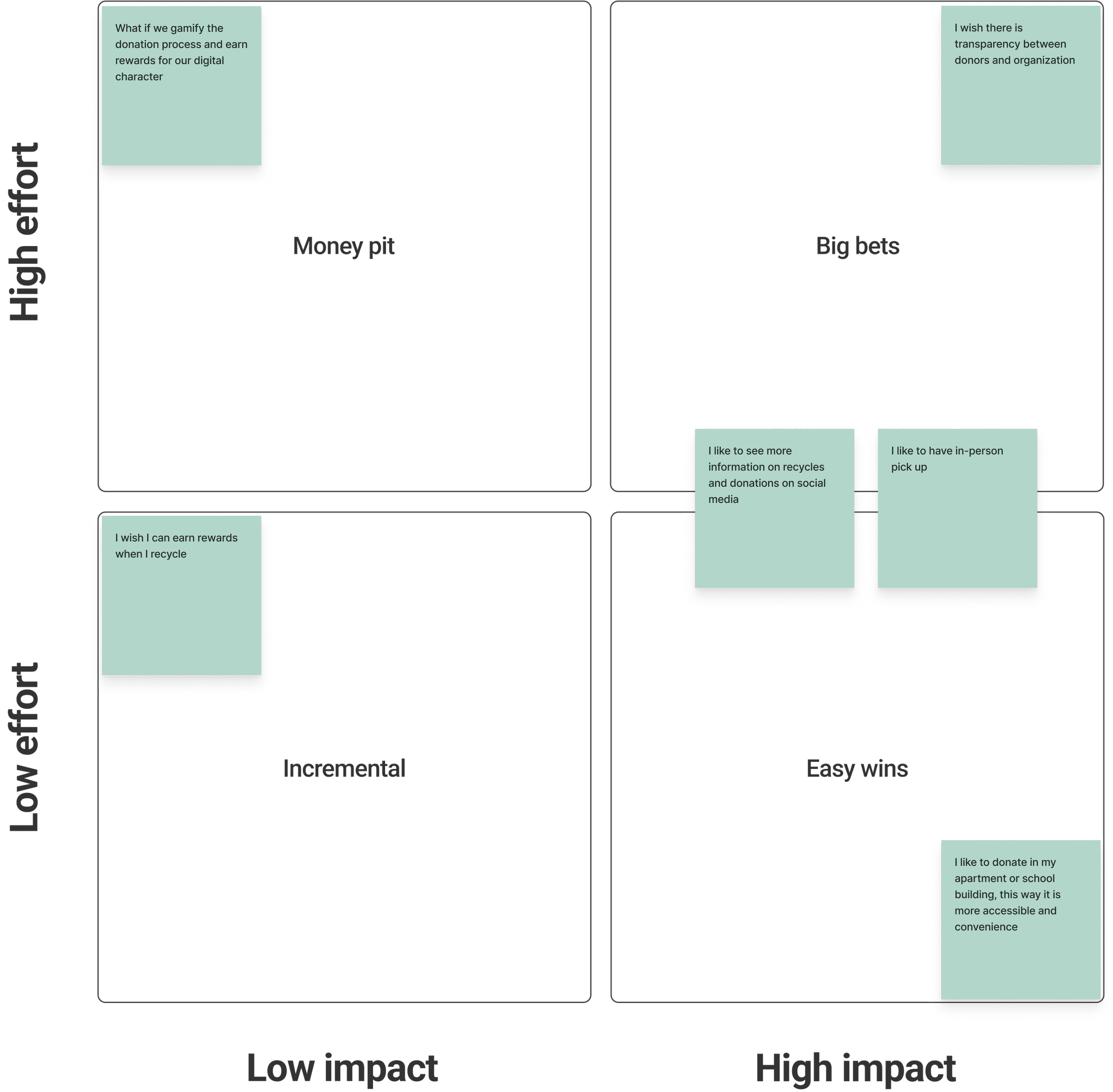
Value Prioritization Matrix
•
After discussion, we drew down our key features for the platform to be:
1 - Clear recycling process
2 - Pick up recycling service
3 - See more information on recycled items
User Flow
•
Product Development
•
•
•
•
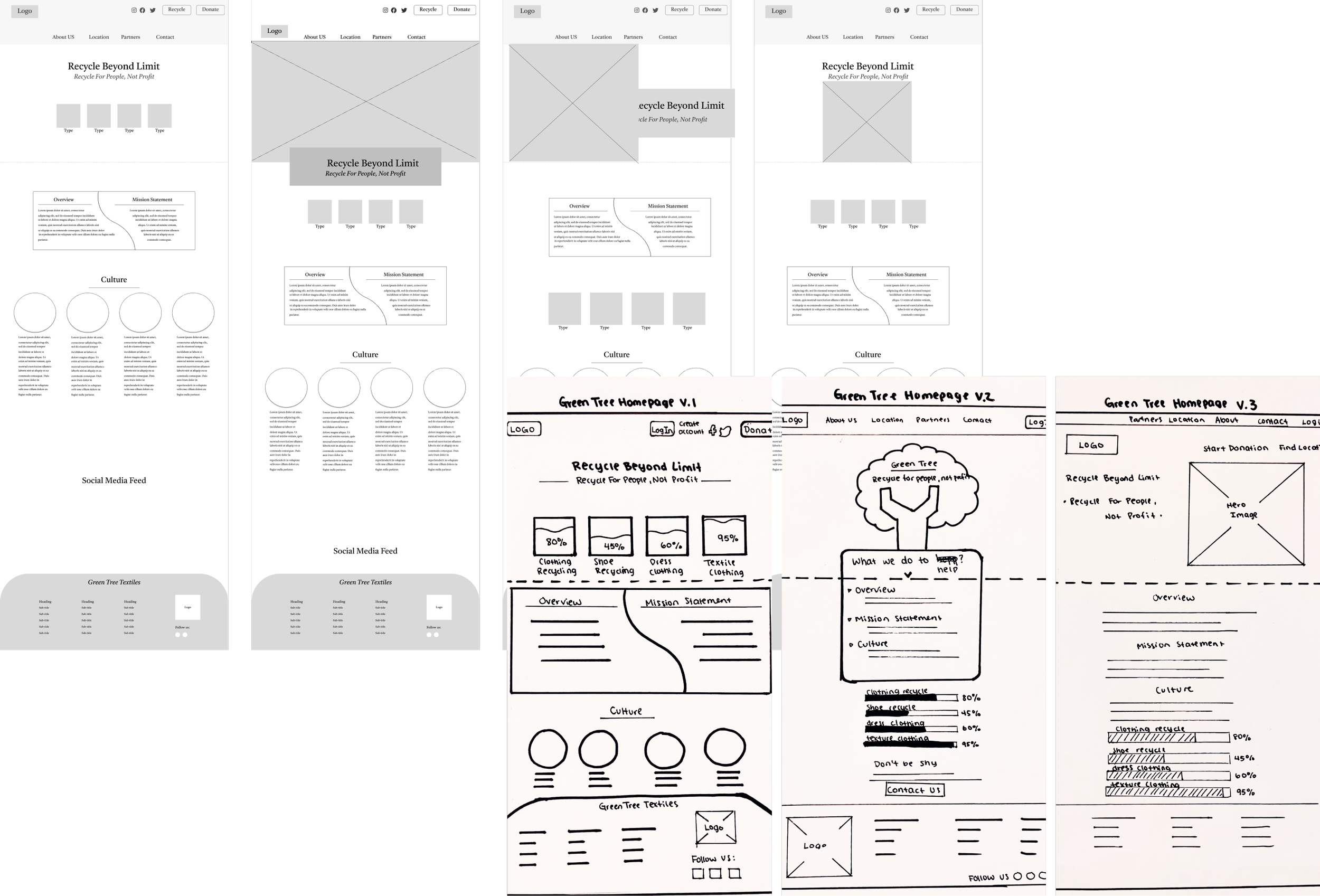
Wireframes
User Interface Analysis
The original Green Tree website failed accessibility color test
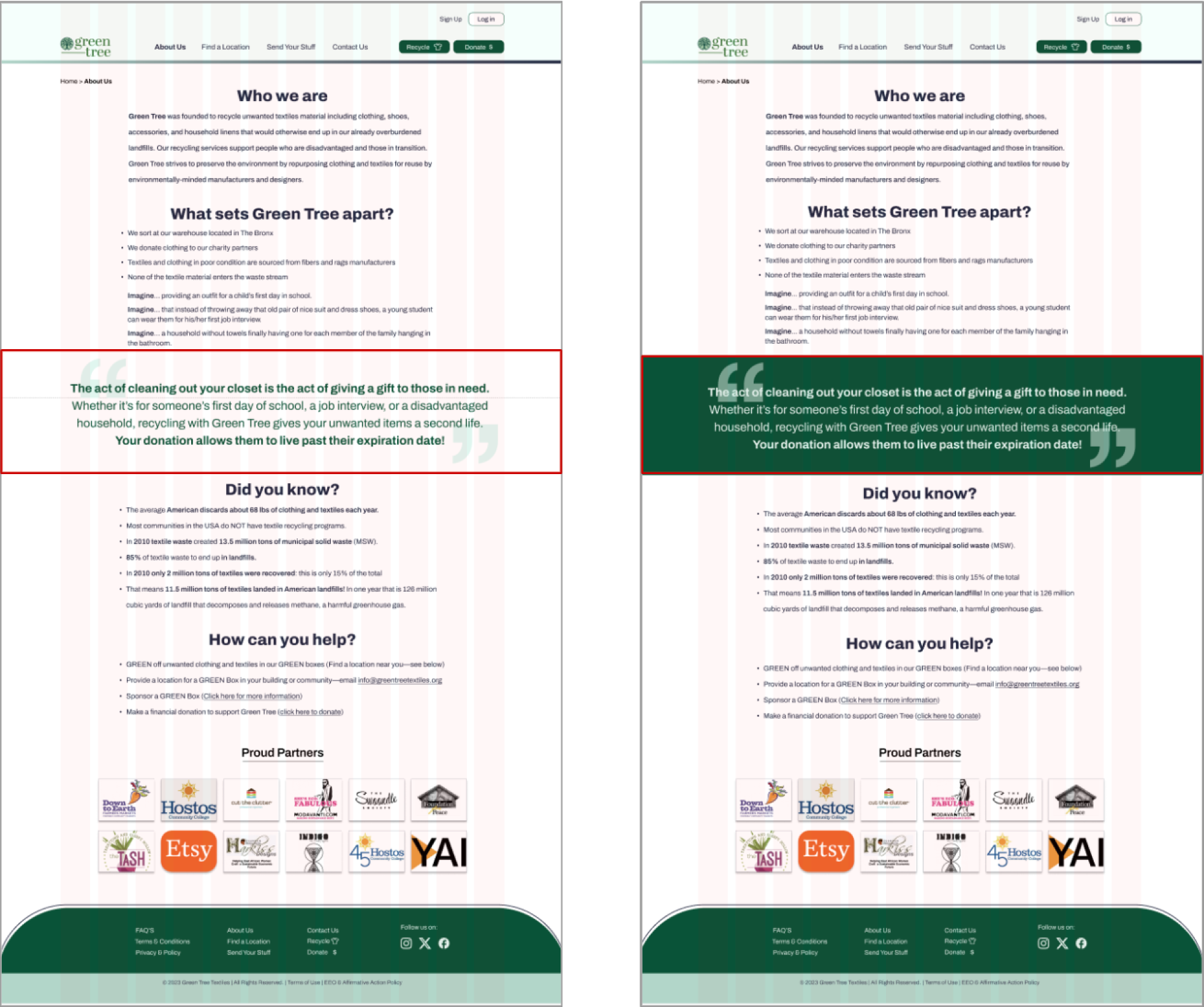
A/B Testing
The right layout is the most interesting and breaks the monotony of an all text layout. It has good hierarchy because the green band stands out making the information important
UI Style Adjectives
Final Product
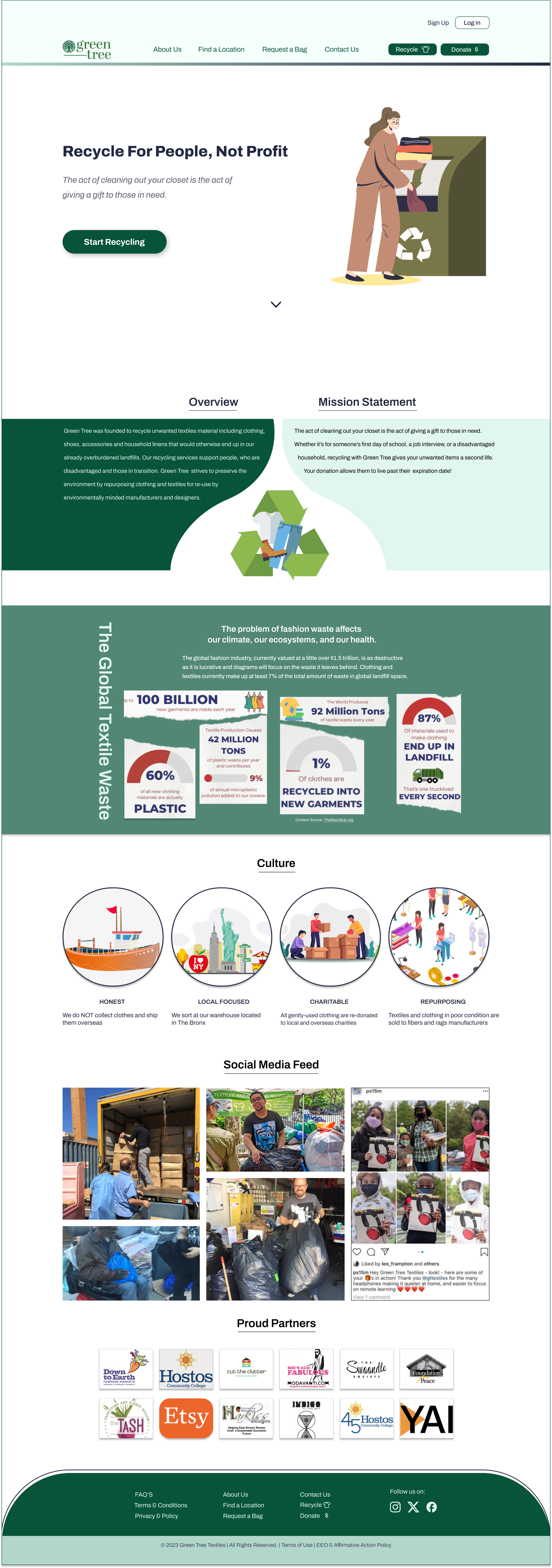
High-Fidelity Prototype
•
Video Walk-Through
•
Desktop Sample
•
Conclusion
•
We discovered that researching good layouts and UI elements can help generate effective ideas that can help elevate a brand.
Iteration and testing does not stop if you want a successful product. Everytime you test, you find little details that have been missed.
More time to come up with various concepts instead of going with the first one that we thought was good.
This was an eye opener for us. We seriously asked ourselves questions about the recycling process as well.
Future Thoughts
•
We will continue to reach out to the Green Tree organization to recommend this new idea/website to them for a fresh and professional look.
Expand on the brand strategy we started with this project—the logo, colors and typeface.
Perform more usability tests and interviews
Add another page that explains where donations go in detail.
Explore the use of videos to tell the story of the Green Tree organization.

